Crafting Effective Storytelling
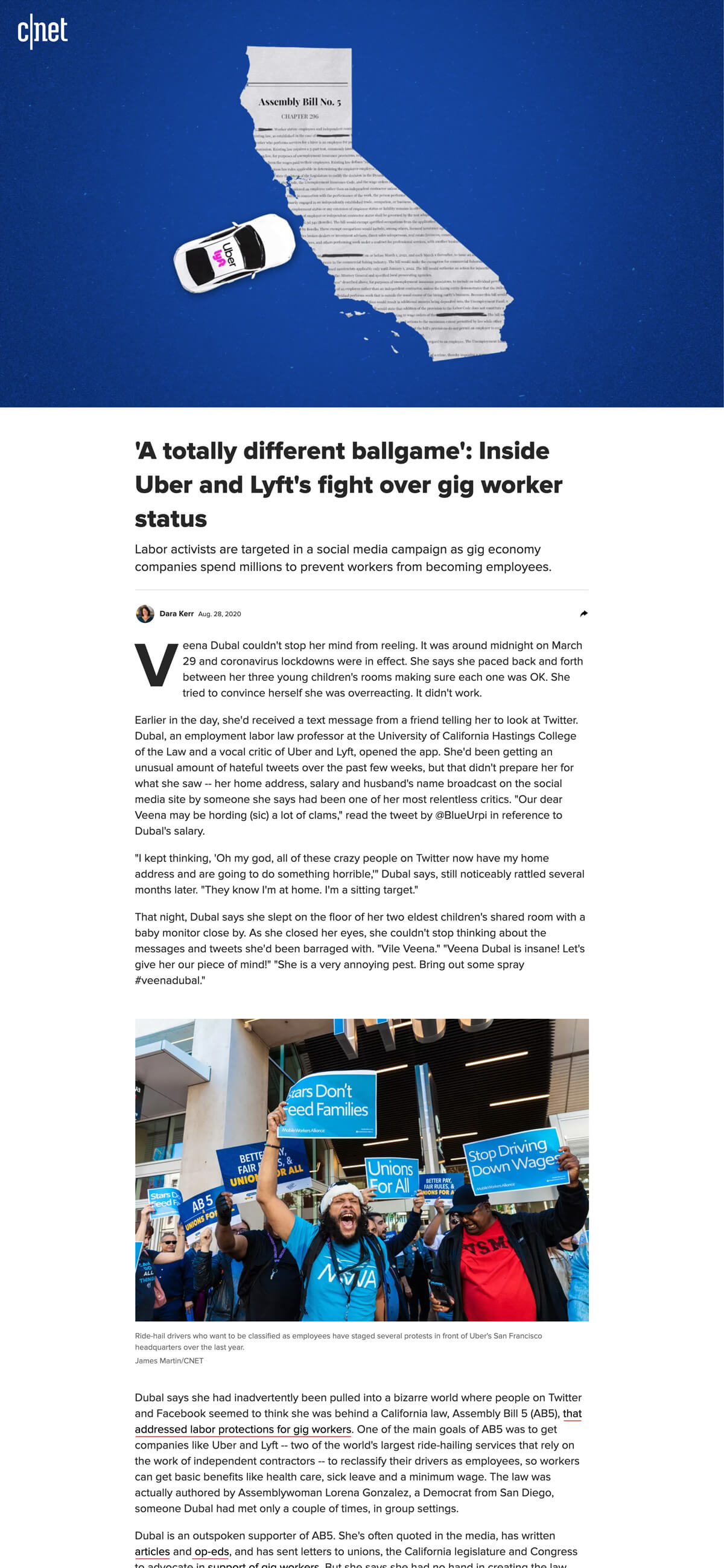
CNET's content coverage and publishing velocity have evolved and rapidly expanded over the past few years. Data suggested that the needs and expectations of the user base have evolved as well. The result — rethink the way we tell stories.

- Site CNET.com
- Year 2018+
- Role Design direction, design strategy, UI, UX
The Article
The majority of CNET's onsite editorial content and user traffic fall into the standard article page. This page type has seen many additive components and incremental design cycles over the years but slowly strayed from the holistic view it once had. When taking a 30,000 foot view, it was apparent there were big opportunities for both the user experience and business metrics.
Improved Desktop Video Experience
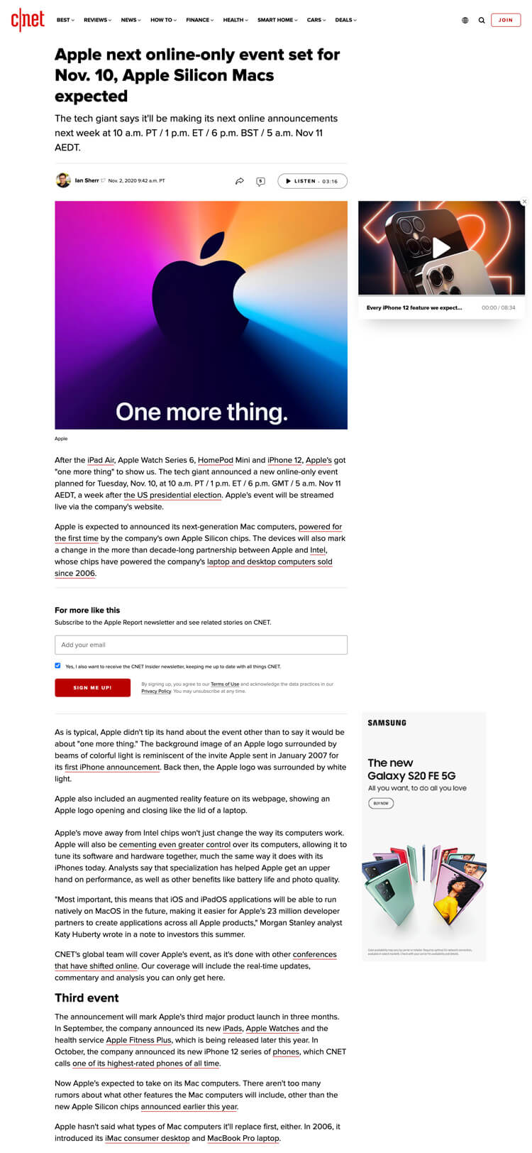
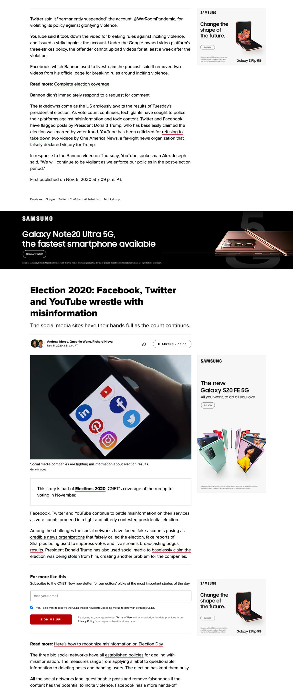
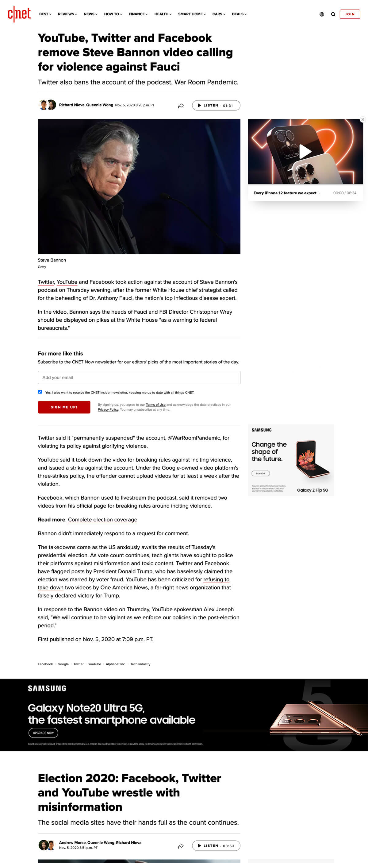
With video revenue being a core business model, the challenge was to strike a balance between serving autoplay video while providing an uninterrupted user experience. The solution was to design for two scenarios: contextually relevant and contextually irrelevant videos.
When a video is contextually relevant to the article, lean into it by displaying a prominent player inline with the reading experience. Upon scroll, fix the video aside in a minimized player, giving way to the user’s reading intent. However, when a video is contextually irrelevant, diminish it to the fixed player, reducing video closures and conversely increasing completion rates.
Additionally, by adjusting the previous minimized player's viewport-based alignment to be confined to the right rail, it prevented intersecting with and obscuring the in-body reading experience. This adjustment was another big contributor to reduced video closure rates/increase completion rates.
Accessibility Inclusion
Web accessibility has gained a big focus over the last few years and its importance was not lost on the company. Contrast ratios were evaluated, removing all instances of color values falling below the AA compliance. Inline links were made clear and obvious through visual queues such as color and underlines. Font sizes were increased for easier legibility. Additionally, an in-house audio player was developed with Google text-to-speech for reading articles aloud in natural-sounding speech.
Streamlined Seemless Articles
The seemless article strategy was in need of improvement. Getting users to effortlessly transition from the end of one article to the beginning of another was being impeded by stacks of underperforming end-of-article recirc, native ads, etc. By cutting the fat and effortlessly flowing users into the next article, page view metrics increased considerably.
The Review
CNET is the industry leader for in-depth tech reviews. But with all its successes, over time the heavily optimized review page became a sacred cow which grew resistant to change.
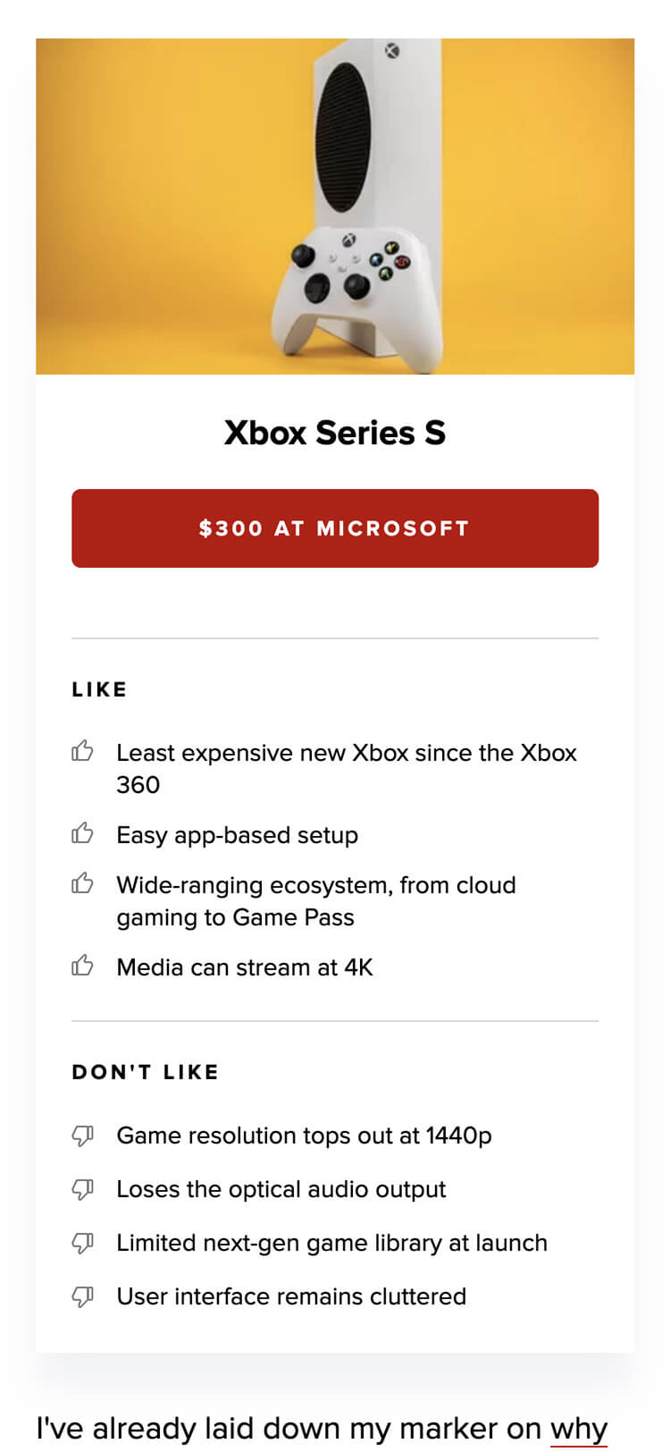
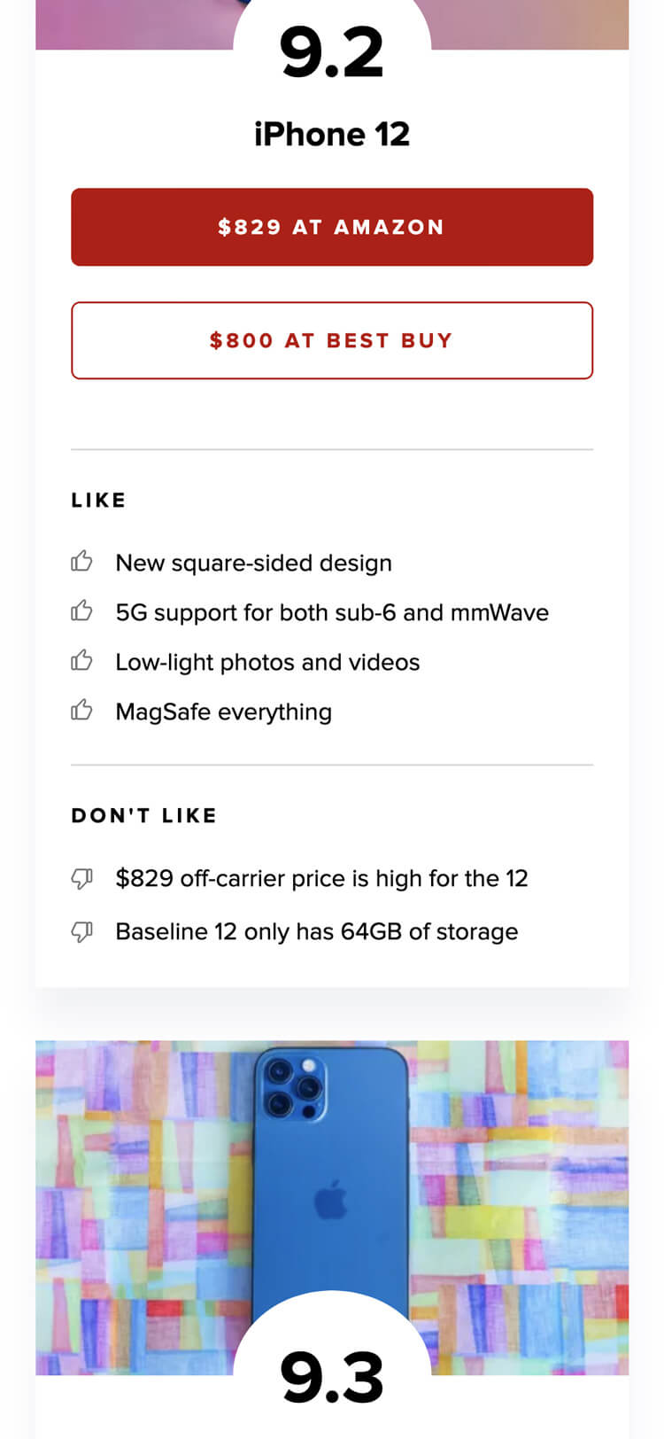
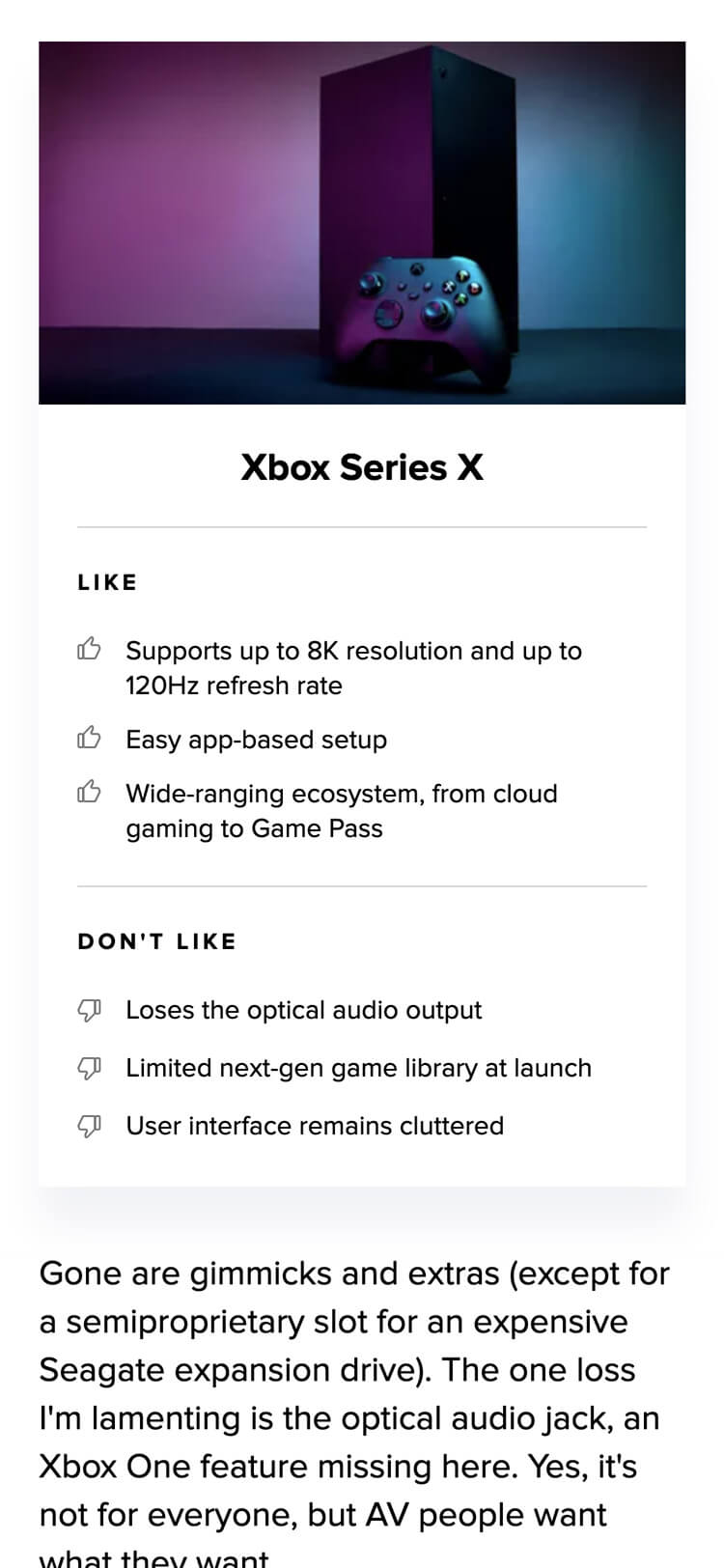
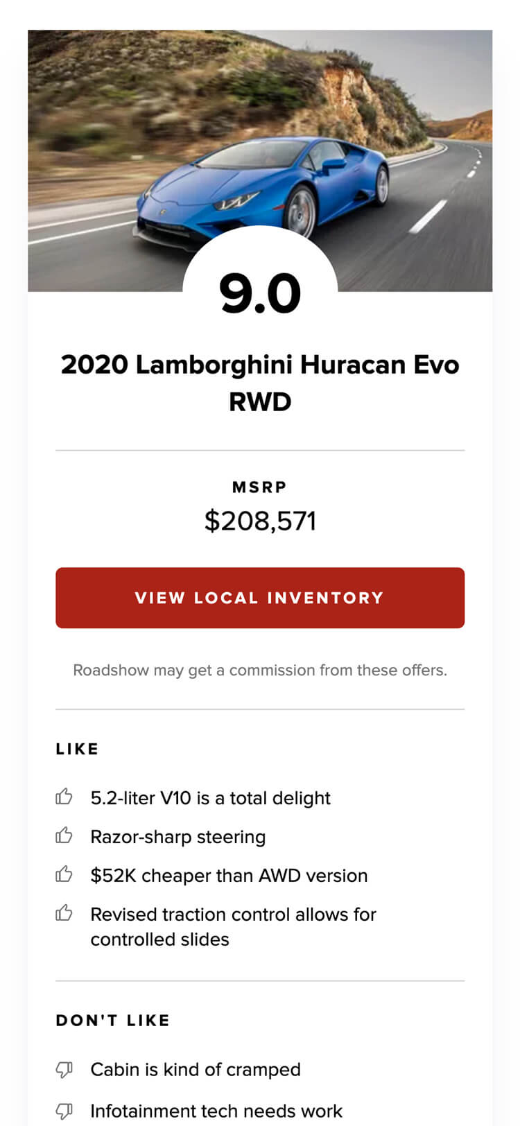
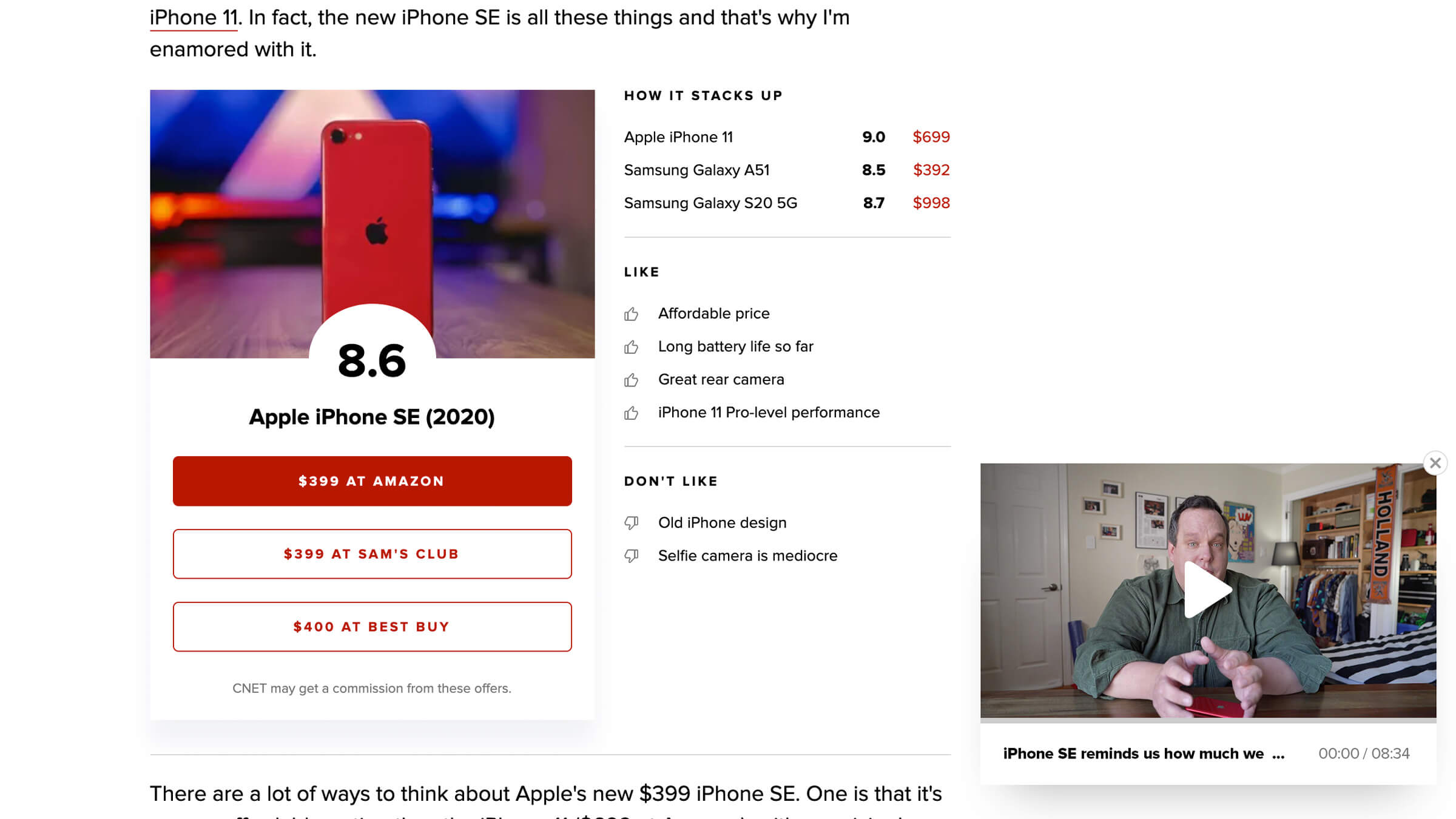
However, due to shifting consumer needs, publishing velocity and SEO algorithms, the review page needed a strategic change. The solution - utilize the standard article page with the inclusion of a modular 'scorecard'...
Meeting Consumer Needs
In the past few years, consumers’ product research habits have shifted. With a growing amount of product options, consumers have shown less interest in reading a longwinded product review in favor of quick recommendations and price comparisons. Even the search term review was shown to be outperformed by best and vs. This created an opportunity for rethinking the way reviews are written and presented.
A scorecard, showing rating, price, retailer options and comparative products in a dense format is the TL:DR users needed. And by positioning this component at the beginning of the read, the essential info is quick to access but still providing a deep dive into the editorial content if desired.
Increased Publishing Velocity
The particular and rigid nature of the longform review page made it burdensome for the editorial staff to publish content at a higher velocity. Given the decline in demand for lengthy product reviews, the payoff for the time spent producing and publishing them in this format was waning. By converting to the article format, leaner content could be produced, resulting in more frequent and faster to market reviews.
SEO Optimizations
As a result of heavy monitization at the top of the page (large video preroll, ad mixes, commerce links, etc.), SEO traffic was underperforming on the review page. On the other hand, the lightweight article page had proven to be well optimized, so by utilizing its content structure, the product review naturally inherited the SEO benefits.
The Feature
The longform feature content produced by the CNET editorial staff needed to be truly engaging. Unlike the revenue-driven standard article or review, the feature page doesn't rely upon advertisements or commerce. From a business perspective, it simply shines a spotlight on the professional journalism of the staff as well as provides a competitive edge for capturing the attention of industry leaders who have a story to tell.
Revamped Hero Graphics
Freeing the page of ad requirements and even the site nav itself put 100% focus back onto the content. But, the real opportunity for impact was enhancing the hero graphic - the first impression upon entry. Previous hero graphic support was limited and lacking but, by collaborating with the Editorial Design team on interactive standards, building CMS support for various file formats (.gif, .mov, etc.) and adding device detection, the feature article is full equipped to deliver an engaging experience, dramatically setting the tone for the premium editorial content.
Scaling Success
With thorough site audits and content analysis, the Design and Product teams were able to properly plan for and scale these storytelling experiences across other CNET Media Group (CMG) properties, such as TV Guide and Roadshow. Limited resources and prioritizations led many of these sites to be somewhat neglected. However, by scaling the revamped article, review and featured content layouts, the design and development efficiencies enabled all brands to reap the benefits with minimal effort.
Growing Business Verticals
Rethinking category hub pages to support rapidly growing and expanding business verticals.
Learn more
