Streamlining Commerce
CNET's commerce strategy has historically centered around product review affiliate links. However, with a shifting audience demand for quick recommendations and the overhead costs of producing these long-form reviews were making it less strategic. The real opportunity lay within the popular best list pages, reimagined through scalable short-form modules.

- Site CNET.com
- Year 2019
- Role Design direction, design strategy, UI, UX
The Listicle
CNET's distinguished long-form product review has its place amongst high profile products, but recent research indicated that the general audience now favors quick, comparable advice when in the purchasing phase. To meet the need, the CNET editorial team needed a way to publish short-form buying advice which could be compared easily to other like products.
The Problem
On the surface, the original CNET best list pages met the need, but looking inward the pages were simply repurposed article pages, loosely formatted by a given editor in what was one long writeup. As a result, the best lists lacked optimizations for the purchasing experience, were a struggle to keep updated and the indiviual list items could not be scaled across other shared lists.
The Solution
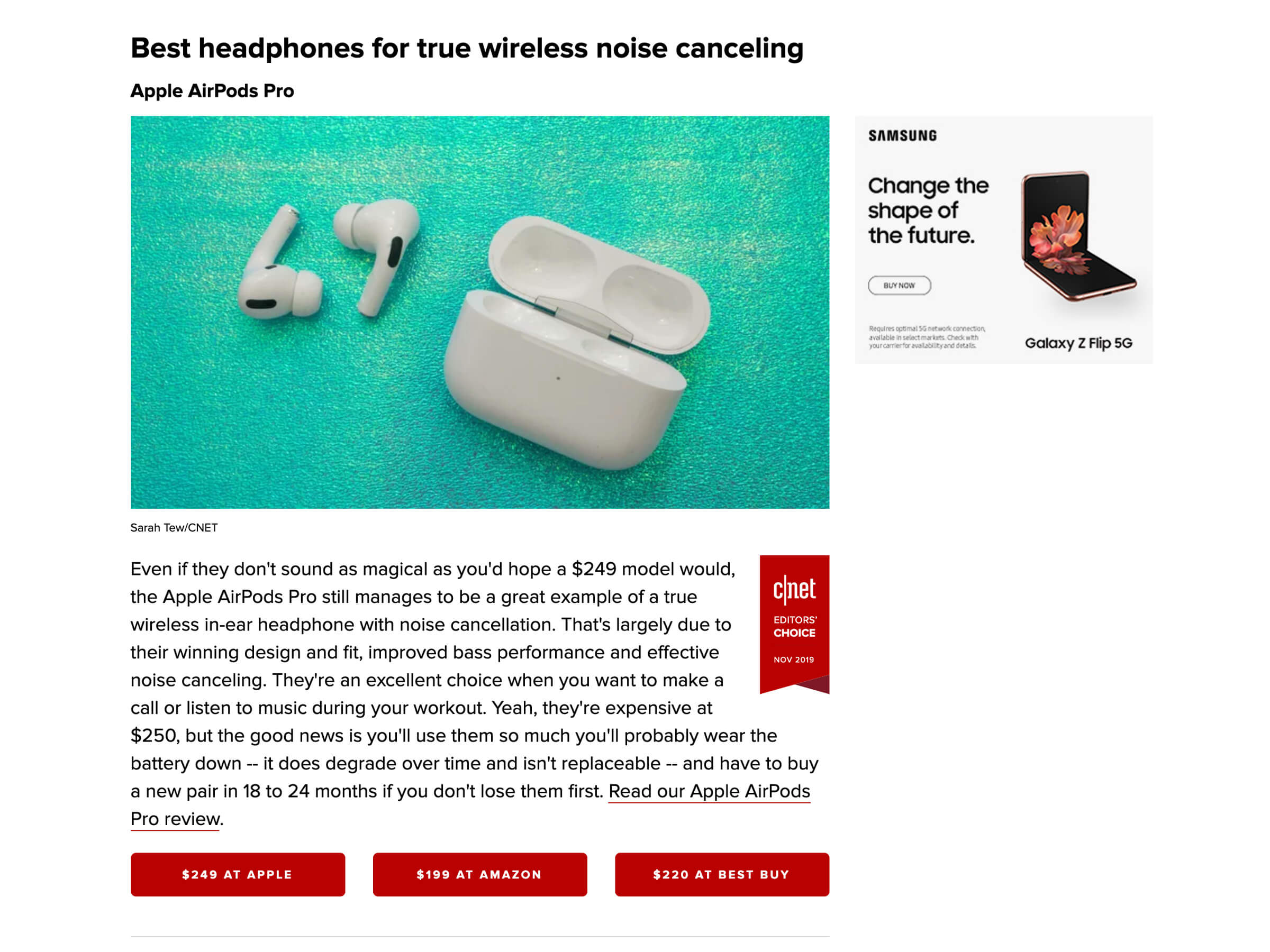
The answer to these issues was to implement the listicle format — stacks of a modular component comprised of a superlative, product name, image, short summary and merchant/pricing options. It has been optimized with just enough context for providing the consumer confidence in their purchasing decision, with an option to read the full review (when available.)
Additionally, these individual product list items can be easily injected into multiple best lists and maintained from a single source within the CMS, making scale and maintenance a possibility.
The Result
On the initial run, the listicle format was an instant success. Conversion rates were significantly higher than the previous implementations that relied upon inline CTA links. And the ease of implementation, maintenance and scalability increased publishing velocity, enabling the editorial team to quickly build upon the success.
The Precap
Though greatly improved upon in its newly condensed format, the average best list still has a somewhat deep scroll depth, potentially leading to scrolling fatigue when trying to view the full list of recommended products. This made for an opportunity to improve even further on the successes of the listicle format by offering users a TL;DR upon arrival — the precap.
The Problem
A top-of-page product list summary seemed the sensible next step, but there were concerns around if a user would feel informed enough to confidently complete a transaction without reading the editorial writeup first.
There was also the question of optimal formatting. Options were narrowed down to two probable formats: a horizontal card carousel or a condensed vertical list view. The card format would allow the main content to sit higher up the page and bring more visual presence to the precap itself. The list format would push the main content further down the page, but would also provide a more dense layout, putting more precap items within view.
The Solution
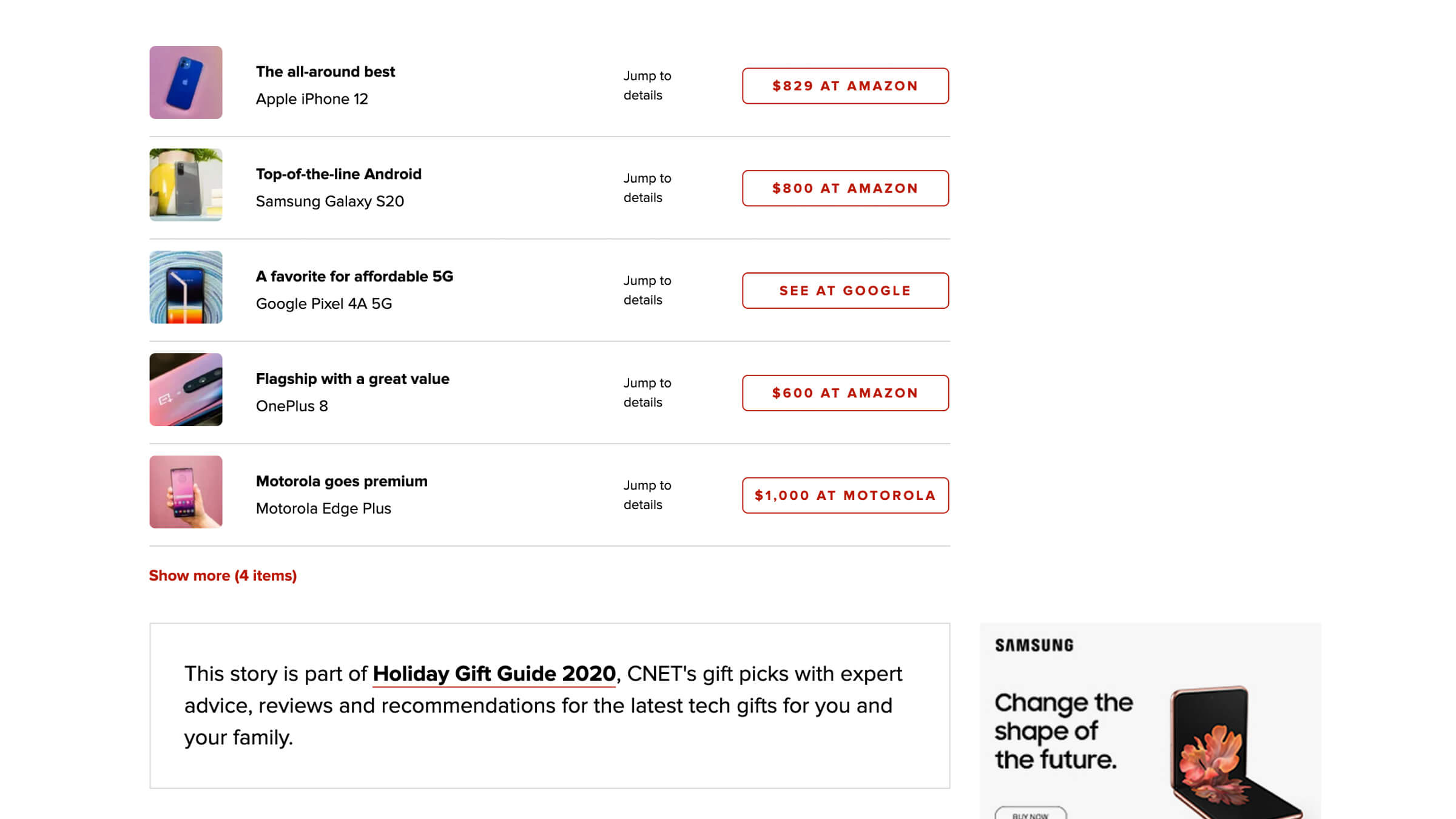
Even with its significantly smaller imagery and CTAs, the vertical list proved to be more effective in testing. This was contributed to its density and content within view, unlike the horizontal cards which extended outside of the viewport. And to reduce the amount of body content being pushed down the page by this vertical format, an expandable "Show more" functionality was implemented after the fifth list item.
As for concerns around users not feeling informed enough before leading out, a "Jump to details" link was placed adjacent to the merchant CTA. This provided an effortless function for users that require a deeper insight the ability to anchor directly to the specific product writeup further down in the experience.
The Result
The precap proved to be a very successful addition, delivering an exceptional increase in conversion. It was clear that users were feeling informed and confident in their purchasing decisions with the information at hand. It also served to show that good is not good enough — there is always room for improvements.
The Best List
The listicle and precap components were a powerful combination for commerce initiatives. But a tool is only as good as the person using it. That said, those components alone were not the final solution.
The Problem
The best list content being produced had always been at the discretion of the given editor. This resulted in a Wild West publishing format, which was noticable from one best list to the next. Best practices had never been established and as we would come to find out, this had sizable consequences on metrics.
The Solution
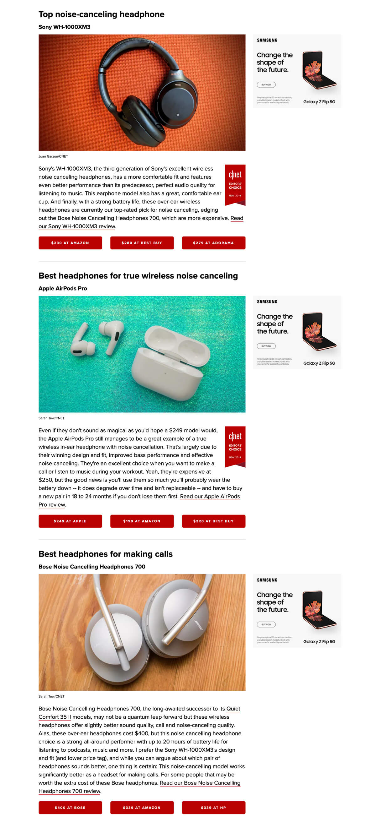
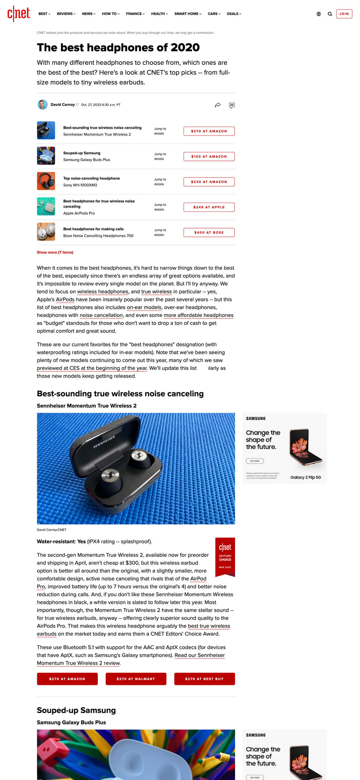
By hypothesizing, testing and analyzing proposed publishing standards — a series of do's and dont's — the Product and Design teams were able to establish a best practices guideline to be upheld by the Product and Editorial teams. And by demostrating through those test results how money would essentially be 'left on the table' when deviating from these best practices, we received immediate buy-in from Editorial.
The Result
In testing these proposed best practices, the results were overwhelmingly positive. For a first run, we chose a highly trafficked best list (Best TV Streaming for Cord Cutters) to A/B test against. When converting to our proposed publishing standards, conversion rates quadrupled in a two week period.
Scaling Success
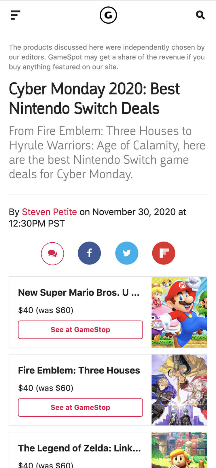
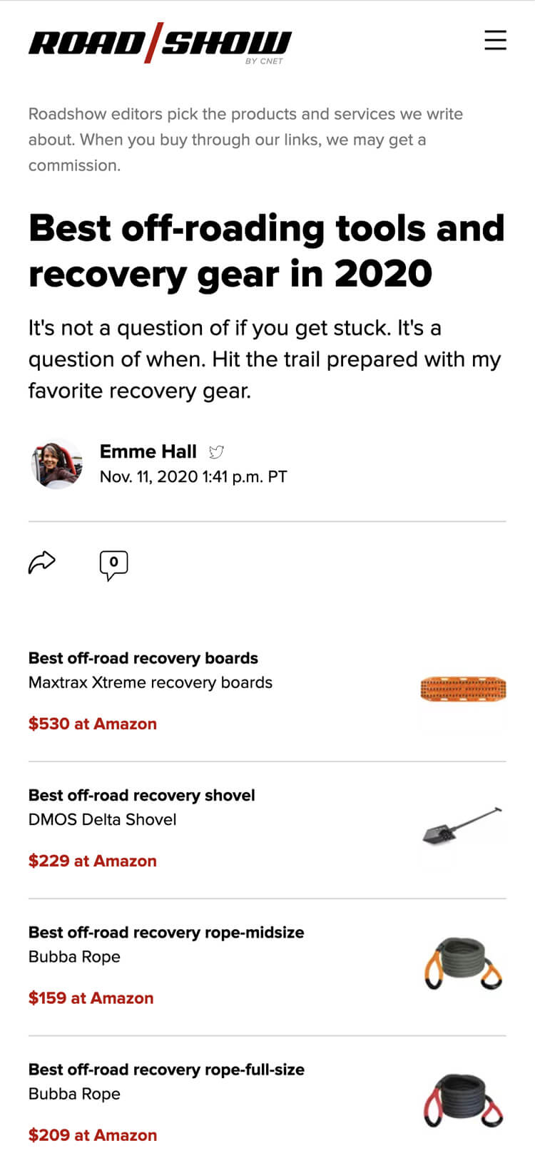
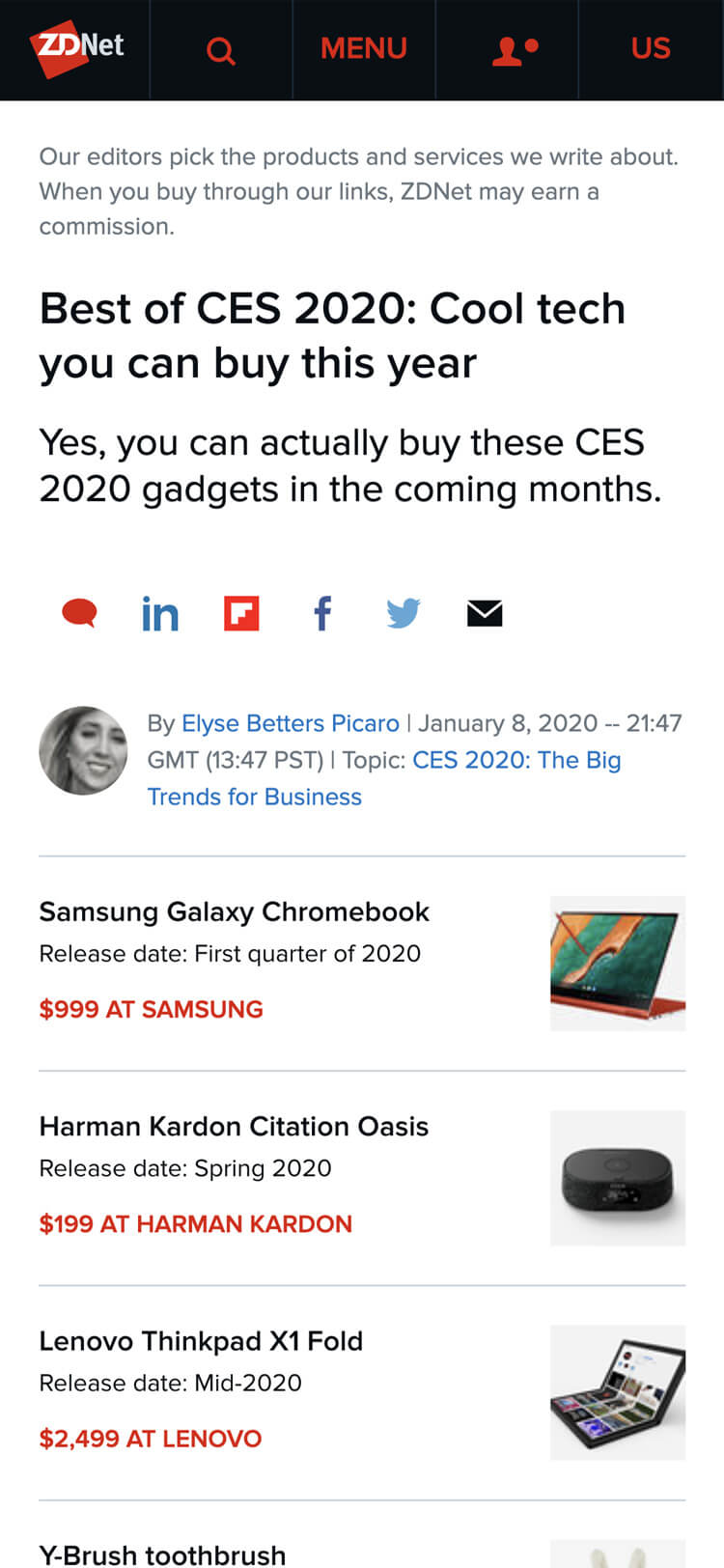
The newly formatted best list page eventually paved the way for editorial commerce throughout the CNET Media Group. It was quickly adopted on various sister properties, such as Gamespot, Roadshow and ZDNet. For proof of concept, in a similar fashion to CNET's A/B test run, ZDNet reformated their Best of CES page and compared results to the previous year. They experienced above a staggering 1200% increase in clickthroughs. There's no looking back now.
Crafting Effective Storytelling
Evolving the way articles, reviews and longform features are produced and presented.
Learn more